Boadicea the Victorious Installation
Date
2026
Client
Boadicea the Victorious
Scope of Work
Spatial & Retail Design
Technical Specification
3D Visualisation
The Brief
Overview
Boadicea the Victorious needed their "Golden Season" autumn campaign — built around macro, colour-matched autumn-leaf photography for six fragrances. Translated from a social and print concept into a retail environment, as part of a second-round design task for a Retail & Visual Merchandising role. The brief allowed either a window display or an in-store pop-up, to be presented and defended to a panel within a 15-minute review.
The Challenge
The campaign's strength was its photography and colour story, not anything spatial. There was no existing retail format to adapt and no confirmed footprint, only a nominal £20k production budget to design against. The challenge was to invent a physical structure that carried the same warmth and craft as the imagery, while staying buildable, briefable and true to the brand's luxury positioning within that budget.
The Approach
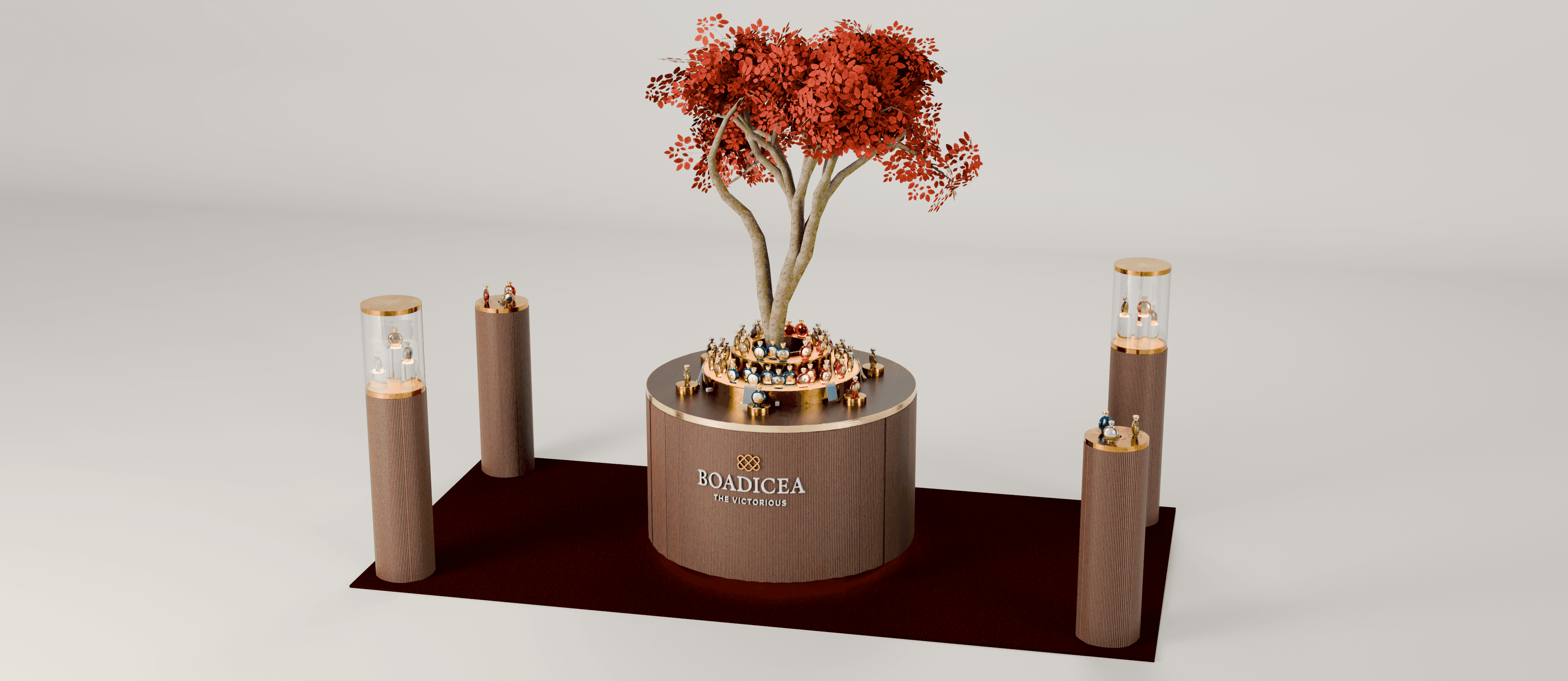
I chose an in-store installation over a window display, leaning into a strength from past retail work rather than the format I had less experience in. The concept centres on a red maple canopy as a hero focal point, surrounded by four sampling totems in a 360-degree layout. Pulling the customer in from tactile discovery at the perimeter to full storytelling at the central island. Materials (fluted walnut, satin brass, a plum silk-sheen carpet) were chosen to echo the campaign's warm, autumnal palette while feeling premium enough for a fragrance counter.
Visual Direction
Warm, autumnal luxury. Fluted walnut and satin brass ground the red maple centrepiece, with a rich plum carpet plane underfoot, a materials palette that carries the campaign's colour-matched photography into a tactile, three-dimensional space.


The Anatomy of the Project
Taking a 2D fragrance campaign and rebuilding it as a physical retail moment. Working from mood and colour story through to dimensioned drawings and material callouts a fabricator could quote from.


Results
The Execution
Designed a central hero island with an interchangeable-canopy mounting system, allowing the foliage to be swapped seasonally without rebuilding the core
Laid out four perimeter sampling plinths for quick, tactile discovery, with sight lines preserved across the full footprint
Specified materials and finishes for every component: MDF substructure, walnut veneer, brushed satin brass cladding, laser-etched branding, acrylic display cylinders, integrated LED lighting
Produced dimensioned plan and elevation drawings (4000mm × 2000mm footprint, 1400mm island, 300mm sampling plinths) sufficient to brief a production partner
Built in modular flexibility: perimeter plinths can detach or reconfigure for smaller boutique footprints while the hero island stands alone
Presented the concept and technical package to the hiring panel within a 15-minute review
The Solution
The panel responded strongly to the concept, particularly the designed-in modularity and the decision to capture the feeling of the campaign rather than transpose its elements directly. After a lot of deliberation, the role ultimately went to a more experienced candidate, but the process validated the approach and sharpened a piece of work now serving as a live example of translating campaign direction into a production-ready retail concept.
